
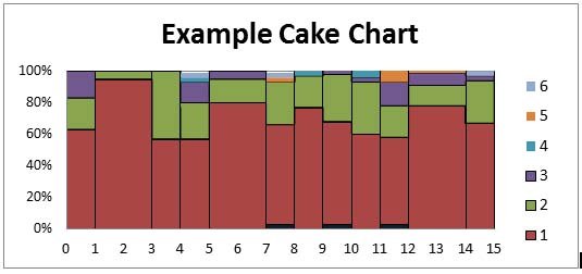
Cake Charts. I’m a little obsessed with cake charts this week. Ever heard of them? When I do a Google-image search for them, pie charts galore come up as well as photographs of really yummy looking cakes. Cake and pie charts have only one thing to do with one another: they are named after delectable treats. How they represent data and what they look like are very different. Here is a cake chart:
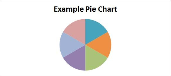
And here, of course, is a pie chart:
Here is a cake:
And here is a pie baked by Brenda Tarbell (soon to be served at a Pie Pop-up at Enzo’s to benefit Nuru in Over the Rhine here in Cincinnati…more on that to come):
So anyway, we have all of this wonderful MPAT data, and it’s broken down at the village level. Alasdair has written a comprehensive report on the conduct of the MPAT that took place this spring in Kuria. The report is great. It describes the training we conducted and how we conducted it, how we actually gathered data, and a bunch of other information around the work. Many of the results of the questions we asked community members are presented in bar charts like this one:
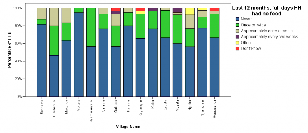
I like the way the bar chart above presents the data. It makes the proportion of each response to the question within a given village clear. It also makes clear the differences in these proportions amongst the 15 villages. For example, it is clear that a much higher proportion of households in Muturio never experienced full days with no food in the past twelve months than the proportion that never experienced them in Gukihuru A.
However, this chart does not represent the relative sample sizes of each village. Some of the villages are smaller than others. For instance, the sample size in Gukihuru A above is only 15 households, and the one in Muturio is 39 households. So the blue block in the bar above Gukihuru A represents 7 responses while the blue block above Muturio, though a little less than twice the size of the one above Gukihuru A, represents a whopping 37 responses. This is why I have become a little focused this week on trying to get this data into a cake chart. A cake chart, as I am envisioning it, would represent the size of the village along the x-axis.
When I was a consultant, we used cake charts to depict market breakdowns. The x-axis would be products, the y-axis percentage as you see above, and companies would constitute the data sets. Unfortunately, I’m having trouble building a cake chart that includes the relative sample sizes of each village, so I’m here to solicit help. Any thoughts on this from my former consultant friends or anyone else?
Also, by the way, let me know if you want to see the MPAT report! I’ll have a final version of it in about a week and a half, and in the meantime, you can download summary.